
Maximizing Impact: Tips for Creating Posters That Convert
In the digital age, posters may seem like a dated form of marketing, but they remain one of the most powerful tools to capture attention, convey messages, and convert leads. Whether displayed on street corners, in local businesses, or in your store window, a well-designed poster can make a lasting impression and drive customers toward taking action. If you’re looking to create posters that not only stand out but also convert, here are essential tips to ensure your designs pack a punch.
1. Know Your Audience
Before you even begin sketching out ideas for your poster, take a step back and think about your audience. Who are they? What problem are you solving for them? What emotions do you want to evoke? Understanding these key elements is the foundation for a poster that resonates.
For example, if your target audience consists of young professionals looking for a gym membership, your poster should feel modern, sleek, and energizing. On the other hand, a poster targeting parents for a children’s product might benefit from playful fonts, bright colors, and clear, concise messaging.
Knowing your audience ensures that your design is more than just visually appealing – it will speak directly to the people you want to reach.
2. Use a Bold Headline
Your headline is the first thing that will grab your audience’s attention, so make it bold and engaging. A good headline should communicate the core benefit of what you’re offering in a few words. It should be clear and compelling, leaving no room for ambiguity.
For example, instead of a vague “Summer Sale” headline, try something more direct like, “Up to 50% Off – Your Dream Vacation Awaits!” This immediately communicates a sense of urgency and benefit.
Keep in mind that people often skim posters quickly, so make sure your headline is large enough to stand out from a distance and can be read in seconds.
3. Keep Your Design Simple and Clean
One of the biggest mistakes in poster design is overcrowding the space. While it can be tempting to cram as much information as possible, this often leads to a cluttered and confusing design. To maximize impact, keep the design simple, focusing only on the most important information.
The rule of thumb is to use the “5-second test.” Imagine your poster in a busy environment like a subway station or mall. Will someone be able to understand the core message in five seconds? If not, it’s time to simplify. Stick to the essentials: a catchy headline, a clear visual, and a call-to-action.
READ MORE : Health HOME Your Ultimate Guide to a Healthy Lifestyle
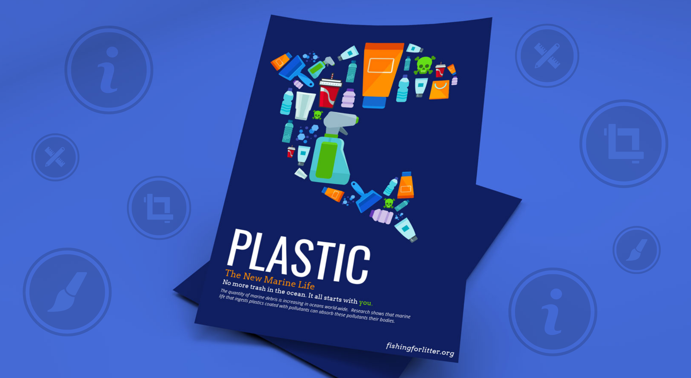
4. Use Striking Visuals
Humans are naturally drawn to visuals, and the right image can make all the difference in the success of a poster. High-quality images and graphics are key to capturing attention and reinforcing your message. These visuals should not only complement the tone of your campaign but also align with your overall objectives.
For example, if you’re promoting a fitness class, a dynamic image of someone actively engaged in the class can help energize your audience. For product advertising, a crisp, detailed photo that showcases the product’s features will create a sense of clarity and appeal. Always ensure that your image supports the text and doesn’t overwhelm it – a balanced design is crucial.
Additionally, it’s important that your visuals speak directly to the needs and desires of your target audience. While a serene image of a landscape may be ideal for a wellness retreat, it’s unlikely to resonate with consumers interested in the latest tech gadget.
Finally, consider enhancing your poster with custom coatings and lamination to elevate the visuals. A glossy finish can make colors pop and add a professional touch, while a matte coating can lend a sophisticated and refined look. Lamination can also increase durability, making your poster more resistant to wear and tear, especially for outdoor or high-traffic environments. These additional touches can help your poster stand out even more, reinforcing its impact and longevity.
5. Color Choices Matter
Color is a powerful tool in design, as it evokes emotions and helps reinforce your brand. Choose colors that match your brand’s personality and your campaign’s message.
For example, blue is often associated with trust and professionalism, which is why it’s commonly used by financial institutions. Red, on the other hand, evokes urgency and passion, making it a great choice for a sale or a time-sensitive offer. Bright and cheerful colors, like yellow and orange, can create a sense of optimism and excitement.
However, be mindful of how colors work together. Too many contrasting colors can make a poster look chaotic, so aim for a harmonious color palette that enhances your design’s readability and overall aesthetic.
6. Incorporate a Clear Call-to-Action
The ultimate goal of any marketing campaign is to drive action. Your poster should make it crystal clear what you want people to do next. This is where your call-to-action (CTA) comes into play.
Whether it’s “Visit our store today,” “Call now for a free consultation,” or “Sign up online,” make sure the CTA is noticeable and straightforward. Use action-oriented language and place it in a prominent location where the viewer’s eye naturally falls – typically at the bottom or center of the poster.
Additionally, if possible, provide an incentive for immediate action, such as “Limited time offer” or “First 50 customers get a free gift.” This helps instill a sense of urgency and encourages quick decision-making.
7. Balance Text and Space
While the temptation to fill every inch of your poster with text may be strong, remember that whitespace (or negative space) is just as important as the information you’re conveying. The strategic use of space can create a clean and focused design, allowing the viewer to absorb the message more easily.
For instance, if you’re promoting a special event, don’t just list the event’s name, date, time, and location in tiny font. Instead, give each element space to breathe. Use larger fonts for key details and smaller fonts for additional information.
Whitespace helps guide the viewer’s eye and improves the overall readability of your poster.
8. Test and Get Feedback
Once you’ve created your poster, don’t hesitate to test it with a small audience before going big. Show it to a few colleagues, friends, or potential customers and ask for their honest feedback. Do they understand the message? Is the design appealing? Would they act on it?
Their input can help you fine-tune your poster and increase its chances of success.
In Conclusion
Creating a poster that converts requires careful consideration of design principles, audience psychology, and messaging. By keeping your design simple, using bold headlines and striking visuals, and making sure your call-to-action is clear and compelling, you can maximize the impact of your poster campaign. Whether you’re advertising a product, an event, or a service, a well-executed poster can be an invaluable tool in your marketing arsenal.